Play the prototype

Spawn Point

March 2024 – July 2024

How do we develop a fresh identity and experience for gamers in a web-3 space?

Conducted UX Research and designed User Interface for the web-3 gaming platform along with an intuitive brand identity.

Role
Design Lead (Intern)
Duration
20 Weeks
Team
3 Members

Impact

  • Aptos grant

    The branding and pitch we designed for Spawn Point helped the company secure it.

  • Google Cloud

    Architecture support, secured with the same pitch.

  • ICC Camp S1

    Accelerated, with demo days at Google Cloud Singapore and the Hong Kong Web3 Festival 2024.

  • 27 partner games

    Signed as Spawn Point exclusives: every game in the prototype.

Short on time? See just the work

Spawn Point is a Web-3 based gaming platform which tends to elevate the experience of gamers by rethinking how they access games, own assets, and connect with each other.

Collage of the Spawn Point interface screens, the logo in three colourways, the wordmark and two characters.

Chapter 01

UX Research

From a first conversation with the CEO to a list of features worth designing.

  1. Product Definition
  2. Value Proposition
  3. Secondary Research
  4. Market Study
  5. Focus Group
  6. Final Insights

01

Product Definition

What exactly are we making here? I started by defining the product and understanding the context around the possible opportunity statement.

An interview with the CEO and a few other stakeholders gave me the CEO's initial hypothesis for the vision and mission statements, brand personality, and the platform's key USPs.

  • Opportunity area card: How might we elevate the experience of gamers on a web-3 gaming platform and generate profits for investors and stakeholders?
  • Mission card with four pillars: flexible game access, user-friendly interface, thriving gaming community and interoperable in-game assets.
  • Vision and USPs card: quality game rentals and online saving, seamless experience, Web3 transactions, strong community, interoperable assets.
  • Brand personality card: Amicable, Pioneering, Excitement, Dynamic, Secure.

Click a card to read it

02

Value Proposition Canvas

Value proposition canvas covered in sticky notes: gains, pains and customer jobs on the right; products and services, gain creators and pain relievers on the left.

Do people really want it? I conducted a value proposition exercise with the primary audience (end users/gamers/devs) through an online interview session, which helped me validate the CEO's hypothesis and introduce a few necessary revisions.

03

Secondary Research

Who are the people we are designing for? My secondary research involved going through relevant articles, research papers and community posts to further define the target audience.

Demographics

Psychographics

Value seekers

Who they are

  • Students
  • Young professionals
  • Gamers with limited income

What they want

  • Affordability
  • Value
  • Variety

How to win them

  • Rental model for new games (no upfront cost)
  • Free-to-play with optional purchases
  • Focus on casual & free-to-play genres (indie, puzzle)
Engaged gamers

Who they are

  • Hardcore gamers
  • Completionists

What they want

  • Extensive libraries
  • In-game item ownership

How to win them

  • Library access through rentals (longer for complex games)
  • Option to buy & own in-game items
  • Focus on RPGs, strategy games, MMORPGs

Buying Behaviour

  • Money illusion: Players might overspend on virtual items due to the illusion that larger quantities of virtual currency offer better deals, even though the real value is the same.
  • Currency confusion: Virtual currencies can be confusing as they are not directly convertible to real currencies, making it difficult to track spending.
  • Transaction utility: Players might be drawn to deals based on their perceived value (e.g., buying bundles with bonus items) rather than the actual utility of the items themselves.
  • Medium maximization: Arbitrary virtual currencies like points or coins act as mediums of exchange and can influence spending behavior. Players might overestimate the value of rewards due to the "illusion of a scale" (e.g., bonus points) and the feeling of certainty associated with point systems.

User Personas

After gaining a clear understanding of my users' relevant psychographics and demographics, I prepared the following personas to summarise my user research.

  • Persona board: Sarah Jones, 24, college student. Goals, motivations, habits, challenges and why Spawn Point fits.
  • Persona board: David Lee, 30, software engineer. Goals, motivations, habits, challenges and why Spawn Point fits.
  • Persona board: Charles, 56, retired. Goals, motivations, habits, challenges and why Spawn Point fits.

Click a persona to read it

04

Market Study

What are others in this field doing? As part of the market study, my team performed a brief competition analysis and trend research to get a clearer view of which features we could take advantage of, what to avoid, and which game genres are appealing to the audience.

They looked at the layout, visual design, UX and key features of each platform, and scored the two giants, Epic Games and Steam, on the System Usability Scale, with SUS surveys sent to their regular players.

System Usability Scale Industry average ≈ 68
Steam 73.75B · Good
Epic Games 60.75C · Okay

05

Focus Group Discussion (FGD)

Are we all on the same page? At the end of the research phase, we conducted a focus group discussion with all stakeholders to review and align on the insights gathered.

  • 2–3 Developers
  • 2–3 Pro gamers
  • 1–2 Designers
  • 1 CEO
  • Facilitated by Ninad Ingole, Head of Design
Focus group discussion board with the goal, context, participants, discussion checklist, and insights for the home page, game page, pains and gains.

06

Final Insights

What were our conclusions? After the FGD we drew the final insights from all our research and analysis.

"What people say, think, do and feel are always different, especially in a community as diverse as gamers."

Empathy Map

Says
  • "I have too many games, I don't know what to play!"
  • "I hate waiting for downloads to finish."
  • "I wish I could try a game before I buy it."
  • "I want to connect with other gamers who enjoy similar games."
  • "I'm worried about spending too much money on games."
Thinks
  • "Maybe I should just watch a streamer play."
  • "Why is this download so slow?"
  • "I hope this game is worth the money."
  • "Should I join a gaming online community?"
  • "What if I spend all my money on games I don't even finish?"
Feels
  • Frustrated with indecision paralysis.
  • Impatient with slow download times.
  • Hesitant to spend money on unknown games.
  • Isolated from other gamers.
  • Anxious about spending too much.
Does
  • Browses through endless game libraries.
  • Checks reviews and gameplay videos.
  • Waits impatiently for downloads to finish.
  • Plays free-to-play games.
  • Avoids buying many games out of fear of financial strain.

Goals

  • Flexible Game Access

    Rent high-quality games with time-based options and online save features.

  • User-Friendly Interface

    A clear and intuitive platform for a smooth gaming experience.

  • Thriving Gaming Community

    Connect, interact, and foster a sense of belonging through robust community features.

  • Interoperable In-game Assets

    Trade and barter in-game assets within the platform's secure marketplace.

Pain Points

  • Discovery Overload: Users feel overwhelmed by vast game libraries (browsing, checking reviews, etc.).
  • Financial Constraints: Fear of spending too much on games that aren't enjoyed.
  • Download Delays: Impatient with long download times.
  • Limited Engagement: Difficulty finding the next game to play.
  • Community Disconnect: Desire for connection with other gamers.
  • Security Concerns: Users might be apprehensive about data security and potential breaches within the platform.
  • Web3 Learnability Concerns: Users unfamiliar with Web3 concepts may find it difficult to navigate and understand features like in-game tokens.
  • Discrimination Concerns: Users might encounter harassment, bullying, or discrimination based on various factors within the online community.
  • Limited Time: Users have limited time for gaming and desire a streamlined experience.

Inspirations

From Epic Games

  • Aesthetics
  • Navigation between different sections
  • Purchase flow
  • Personal: custom theme

From Steam

  • Usability
  • Purchasing flow
  • Categorization and filters
  • Personal: custom theme
  • Search function

Look like Epic Games. Work like Steam.

Features

Drawn from the insights, this list is what made the UI work actionable.

  • Actionable information about games.
  • Playtime estimates, reviews (percentage format), FAQs, and a "people also like" section.
  • Gameplay video integration.
  • Seeing friends' activity.
  • Pre-made themes or easier installation options.
  • A search bar for specific needs.
  • Clear buttons for playing, wishlisting, and sharing.

Chapter 02

Branding

From a blank slate to a strong narrative, supported by the visuals.

  1. The brief
  2. Early development
  3. The moodboard
  4. The name
  5. The logo
  6. Colour
  7. Type & pattern
  8. In use

The brief

How should it feel? It began at my induction meeting with the CEO, where he talked about why he wanted to start Spawn Point and how the design should feel: quirky, fresh and intuitive, like a universe of characters.

The words from that meeting became a word cloud, and everything that followed grew out of it: the moodboard, the name, the logo, the patterns, the characters, a custom typeface and finally the brand book behind the pitch.

blockchain playground? trustworthy fun Azuki anime? friendly fresh quirky Arcane digital armory? bold an escapee? friendship?

Early brand development

Before the final moodboard, a board full of raw directions. It holds the long logo journey, the very first visual inspiration, the first wireframe visualisations of the platform, and early graphics and character design inspiration.

  1. SPAWN POINT with a dome-and-wing mark.
  2. A black circle cut by a crimson slash.
  3. A crimson slash and a crimson dot.
  4. A crimson slash and a black dot.
  5. The crimson S above a solid black coin.
  6. The S above a coin with a ring cut-out.
  7. The S above a coin with a diamond in a ring.
  8. The S above a coin with a square hole.
  9. The S above a coin with a diamond hole.
  10. The S above a split coin with a diamond.
  11. The final mark, the S above the coin with its square hole and diagonal cut.
The logo journey, from the first mark to the S and the coin
  • An early card: a crimson SP monogram and the SPAWN POINT wordmark beside an ink samurai under a red sun.The very first visual inspiration
  • Three home page visualisations side by side, each with a key-art header over grey wireframe blocks.Initial wireframe visualisation
  • Four banners: the SPAWN POINT wordmark with a hooded figure on crimson, a samurai in crimson smoke, an armoured warrior before the coin, and a cyborg face.Initial graphics inspiration
  • A grid of character references: streetwear and techwear figures, cyborg faces and armoured samurai.Character design inspiration

Every early direction on the brand.

Explore the board

The moodboard

Moodboard with illustration references, design style references, icon sets and pattern studies.
"Woah, perfect. So cool, looks so fun." The CEO

The name

Spawn Point comes from the spawn points in games, where every player enters the world and comes back after every loss.

The project started out as AptosPlay. The CEO wanted to keep a "-Play" suffix, but the gamers I asked found it immature, so it went. After long discussions, Spawn Point, one of the names I suggested, was chosen as the final one.

"Every journey starts at the spawn point. So does every comeback."
  • AptosPlay
  • KronoPlay
  • Moneta
  • Aurum
  • Agon
  • Tyche
  • Midas
  • Runic Realm
  • Akira Play
  • Quasar
  • Rift Realm
  • Spawn Point

Colour

Two segments, two colours. The accents come straight from the research: crimson for the Engaged gamers, the conquerors, and ocean blue for the Value seekers. Ivory and ash ground them.

  • Crimson red#CB2742 · Engaged gamers: mastery and purpose
  • Ocean blue#088897 · Value seekers: playing on their own terms
  • Ivory white#EAEBE4 · Clarity and contrast
  • Ash black#1D1D1D · The ground everything plays on
The mark in six colourways: crimson and black on ivory, on ash, ivory on crimson, and the same three in ocean blue.

Type & pattern

Bicyclette Ultra for headlines: a bold, rectangular face with softened edges that commands attention without feeling harsh. We went looking for something circular and bold, but readable, and Bicyclette was it. Montserrat balances it for body text and UI.

The pattern lives mostly in the background, so it had to be subtle: an element of the brand that still stands out there, but never overpowers the main elements of a composition. That's why we built it from the coin.

Brand book typefaces page: Bicyclette and Montserrat. Brand book page: the coin-half pattern filled with photographs, beside the headline and introduction shown as placeholder bars.

A typeface of our own

A custom display font, Azuki, was created to carry the brand's personality wherever a display face was needed: mainly the brand book and presentations, and only sparingly in the product itself.

A font template filled with a heavy, rounded alphabet: the capitals A to Z, drawn again in the lowercase cells.

Loading, in motion

Two tests for the loading screen. A loader's job is to keep people engaged while they wait, so ours had to come from the brand: the mark, or the pattern.

The S builds onto the coin
A dot runs out into the pixel band

A universe of characters

Characters, not a mascot. Each belonged to the platform itself, not to any one game, with its own personality, backstory and character arc, led by a hero character.

The animation team developed the characters, with their backstories and sketches. The art shown is AI-generated, curated by the team.

  • A hooded figure in white robes with a mechanical arm.
  • A white-haired girl with red headphones and a face mask.
  • A dark-clad samurai leaping with swords drawn.
  • A cyborg face with teal skin and gold circuitry.
  • A figure in a black jacket and a red mechanical helmet.
  • Giant swords planted in a rocky mound.

Brand in use

Tri-fold brochure mockup: the folded cover with the Spawn Point wordmark and a character, beside the open inside with onboarding steps, partner games and the Spawn Point page. Spawn Point billboard: crimson wordmark, the hooded character and a crimson topographic pattern panel. Website mockup: the Spawn Point store home page with a 3D mark banner and featured games, with more screens stacked behind it.

The brand book

Logo, colour, type, voice and brand in use, across 40 pages.

Chapter 03

Interface Design

Turning the insights and the brand into a product: architecture, flows, wireframes, then the final screens.

  1. Brainstorm
  2. Inspiration
  3. Information architecture
  4. User flows
  5. Wireframes
  6. Final UI
  7. Prototype
  8. Testing

07

Minimum Viable Product (MVP)

To prepare an MVP for testing we first put together an Information architecture and all the essential flows inspired by our final insights.

The flows took their inspiration mostly from our secondary research, and our gamers and developers told us which versions would work better and which were doable.

Brainstorm

What could the platform hold? With the insights from the research in hand, we brainstormed what the platform's architecture could actually look like.

A board of grey and yellow sticky notes in clusters: onboarding, home page and store, game page, library, profile, wallet, community, market place, settings, achievements, help and support, and the bars and feedback windows shared by every page.

Inspiration

How do the others do it? Around the brainstorm we pinned pages from the platforms we studied, sorted into the same sections, to decide how our own pages and flows would work.

The brainstorm's clusters filled with screenshots from other gaming platforms: onboarding, store, game page, library, profile, wallet, community, market place, settings and more, with notes beside some.
Thirteen full-length pages from other gaming platforms side by side, from Nintendo, Steam and Valorant to Fortnite, League of Legends and EA Sports FC.

Information architecture

After a lot of brainstorming, we landed on this architecture.

IASPAWN POINTinformation architectureWireframing & UX flowLOGINgoogleapplemetaPrivate keyemail&pwdCREATE ACCOUNTsign up withgoogleapplemetaemail&pwdCHARACTER SELECTIONSTOREtop gamesfree gamesoffersGAME PAGEGAME PAGE CARDSgame Trailer / gameplay videoREVIEWSWrite reviewRead reviewname, descriptionGenre /feature detailsDev/Publisher detailsGame website/ social mediapricingratingsadd to wishlistSHARERedditDiscordmetaCopy linkPLAY/RENT NOWLIBRARYwish listrented gamesbought gameshistoryskinsmost played gamesFRIENDSLast seenFriendsInvite FriendAdd FriendchatFRIEND PROFILE PAGEprofile dataOnline / last seenachievementsShareUser IDChatBlockNEWSNEWS CARDSImageTopic and descriptionRead moreNEWS PAGEMARKETASSERT TRADINGASSERT CARDAssert details and descriptionAssert ImagesPriceBuy/TradeSearchFiltercoin/PriceGameRecentsGAME ADD-ONSREVIEWSWrite reviewRead reviewname, descriptionGenre / feature detailsDev/ Publisher detailsGame websiteSocial media pagespricingratingsadd to wishlistCOMMUNITYSearch People/ msgFilterMost recentMost popularALLDISCUSSIONSARTWORKSARTWORKSPOST CARDSTitle + contentEmbedsCommentsLikes/dislikesShareADD POSTTitle + contentEmbedsBack to top buttonPROFILE PAGEprofile Photo customisationLevel visiblityGame character photosprofile datanameuser idemaildobcountrytwo factor authentiationconnected accountsachievementsACHIEVEMENT CARDSSign outLOGINgoogleapplemetaPrivate keyemail&pwdCREATE ACCOUNTsign up withgoogleapplemetaemail&pwdhelpAbout usSETTINGSPreferencesGraphicAudioLanguageNotificationWALLETCoins earnedTransaction historyBuy coinsWISHLISTGAME PAGE CARDSHOMEAlways at page endABOUT US

Open full size

User flows

We worked on the following essential user flows for the website.

01SPAWN POINTuser flow · buying a gameWireframing & UX flowSTOREWISHLISTSEARCHGAME CARDSGAME PAGEADD TO CARTCARTFor my accountGiftApply coupon if anyCONTINUE TO PAYMENTVisaMaster cardNet BankingPrepaid walletUPIAdd card details according to thepayment modeCONTINUERedirects to the payment portalCONFIRMATION MAIL WITH BILL

Open full size

02SPAWN POINTuser flow · playing or renting a gameWireframing & UX flowHOMEWISHLISTSTORELIBRARYPlay/rent nowChoose TimePlay nowRECHARGE WALLETIf Insufficient balance then play nowbutton will be disabled
Playing or renting a game
03SPAWN POINTuser flow · the community hubWireframing & UX flowCOMMUNITYALLCOMBINATION OF ALL THE BELOW CARDSSCREENSHOTSSCREENSHOT CARDSScreenshotLike/ dislikeAwardsCommentsUsername of the posted accountARTWORKSARTWORK CARDSArtwork gif...Like/ dislikeAwardsCommentsGame nameBROADCASTSBROADCASTS CARDSThumbnailAccount of postingNo of viewersVIDEOSVIDEOS CARDSThumbnailAccount of postingNo of viewersLike/ dislikeAwardsCommentsNEWSNEWS CARDSTitlecontentScreenshotGUIDESGUIDES CARDSTitlecontentImageRatingAwardsCommentsREVIEWSREVIEWS CARDSTitle/Game nameDate of postContentCommentsAwards

Wireframes

Then came the wireframes, to test the flows before any visual design. They began on paper, then became rough lo-fi pages.

Photos of hand-drawn wireframes on paper, beside two early digital wireframes of a game page and a wishlist.
Three grey lo-fi pages: a home page with a logo, a title and two game rows; a second home page with a grid of game cards; and a community feed with suggested people, posts and trending topics.

Final UI

Where the research shows up. The UI was built directly on the wireframes, and each screen went into development as soon as it was designed. Every key screen answers something we heard in the research.

Recorded in the clickable prototype.
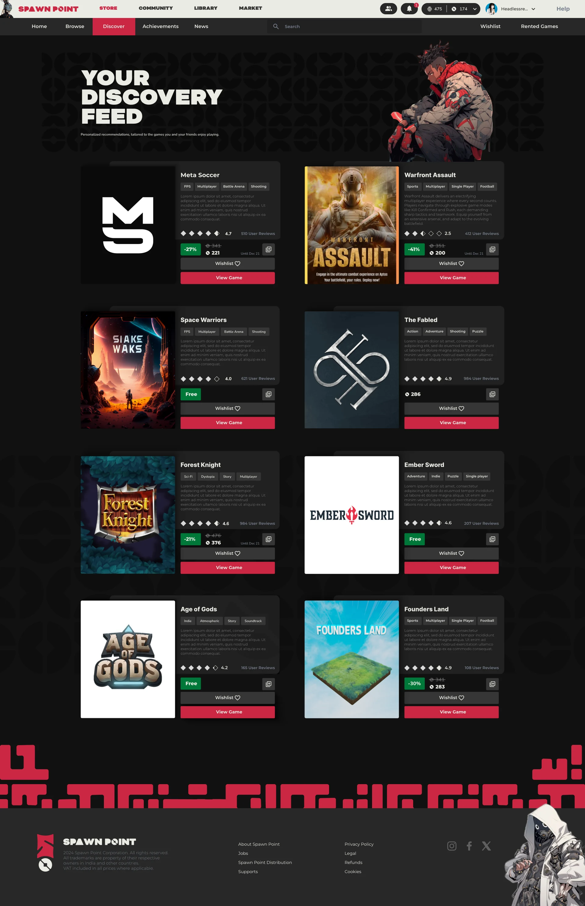
  1. Discover

    "I have too many games, I don't know what to play!"

    Your discovery feed: personalised picks instead of an endless library.
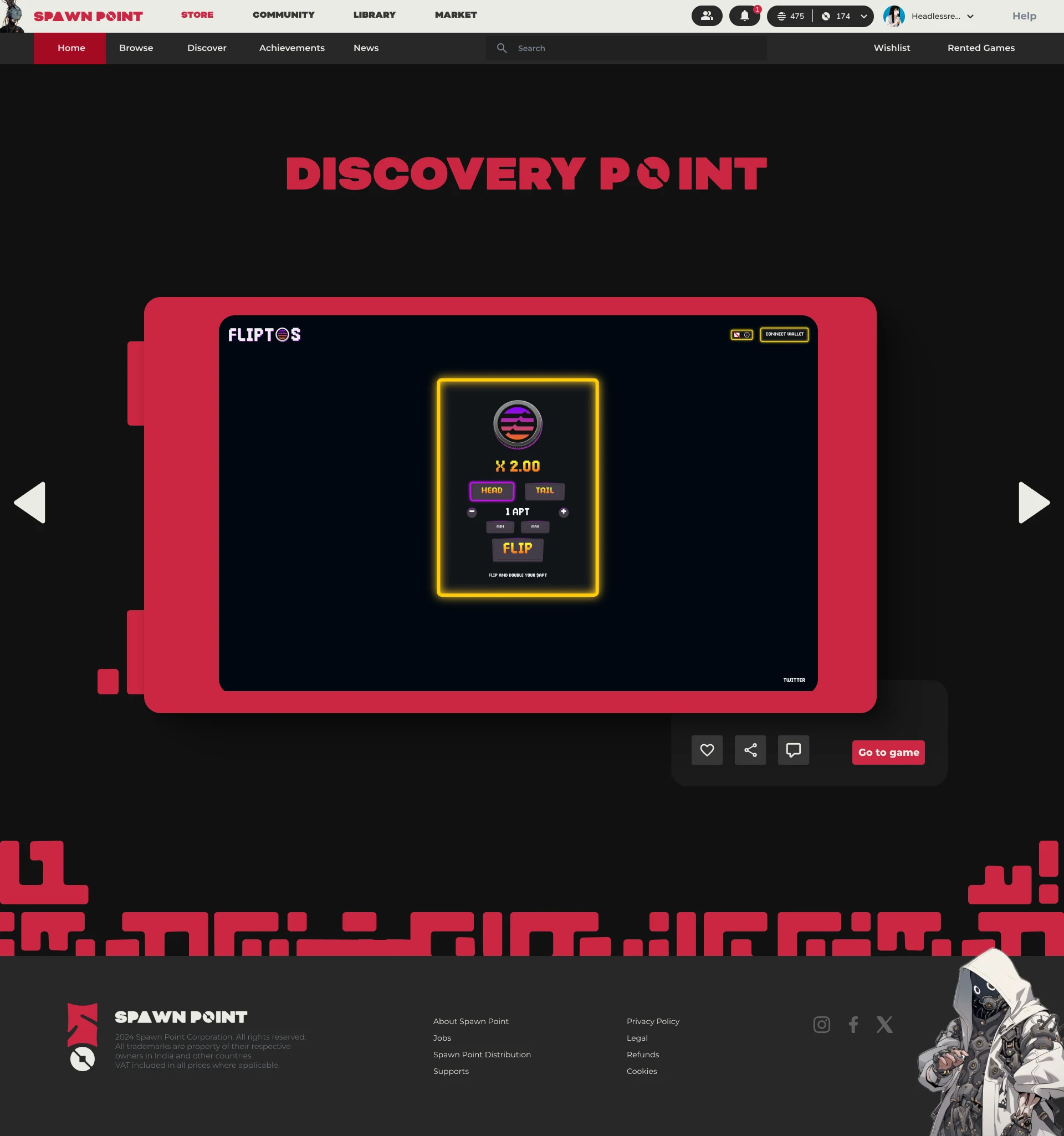
  2. Try first

    "I wish I could try a game before I buy it."

    Discovery Point: play a trial before you rent or buy. The CEO pictured it as reels for games; I pushed back that desktop habits aren't mobile ones and that a trial should tease a game, not replace it.
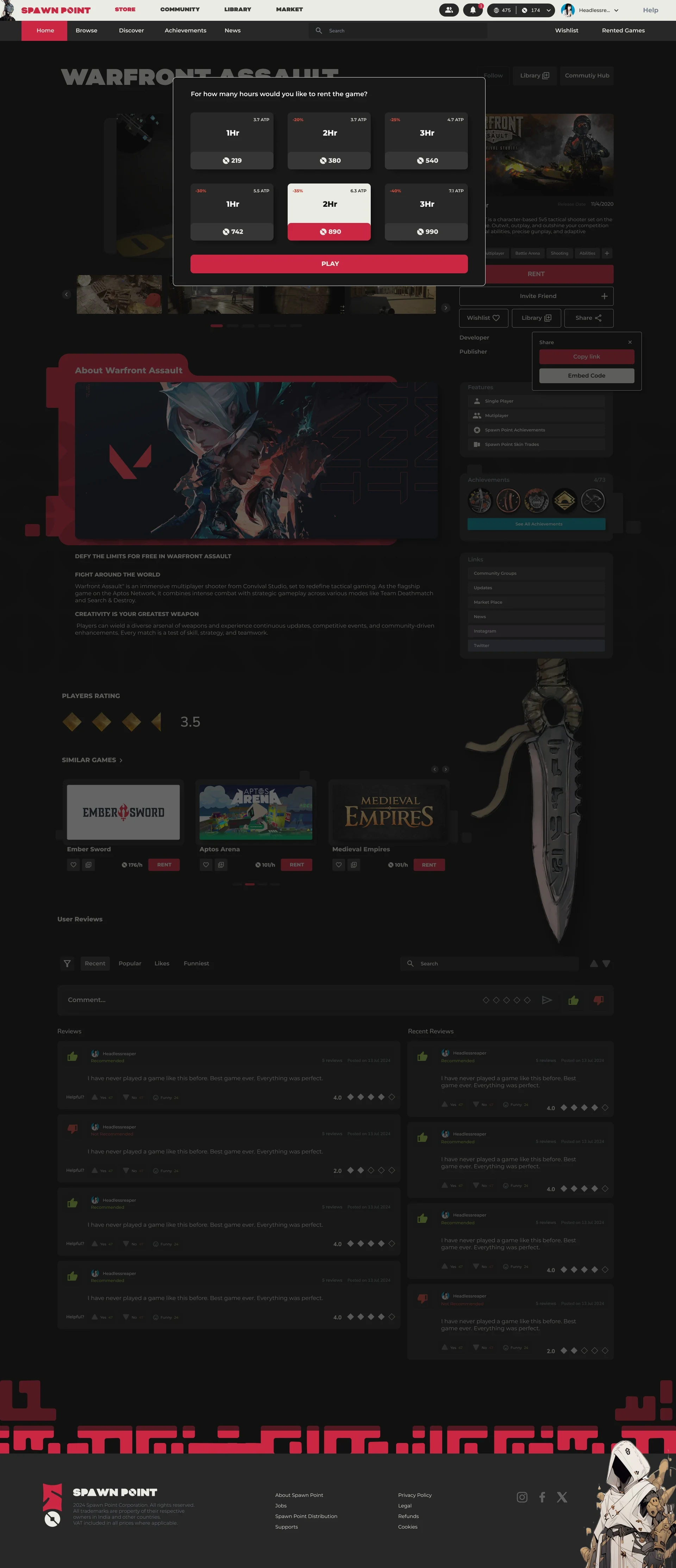
  3. Rent by the hour

    Fear of spending on games you won't enjoy

    Rent by the hour, with longer sessions cheaper per hour. Your progress saves online, so you can renew later and carry on. It's one of three ways to pay, alongside Arcade Sessions for quick escapes and Subscriptions for a routine.
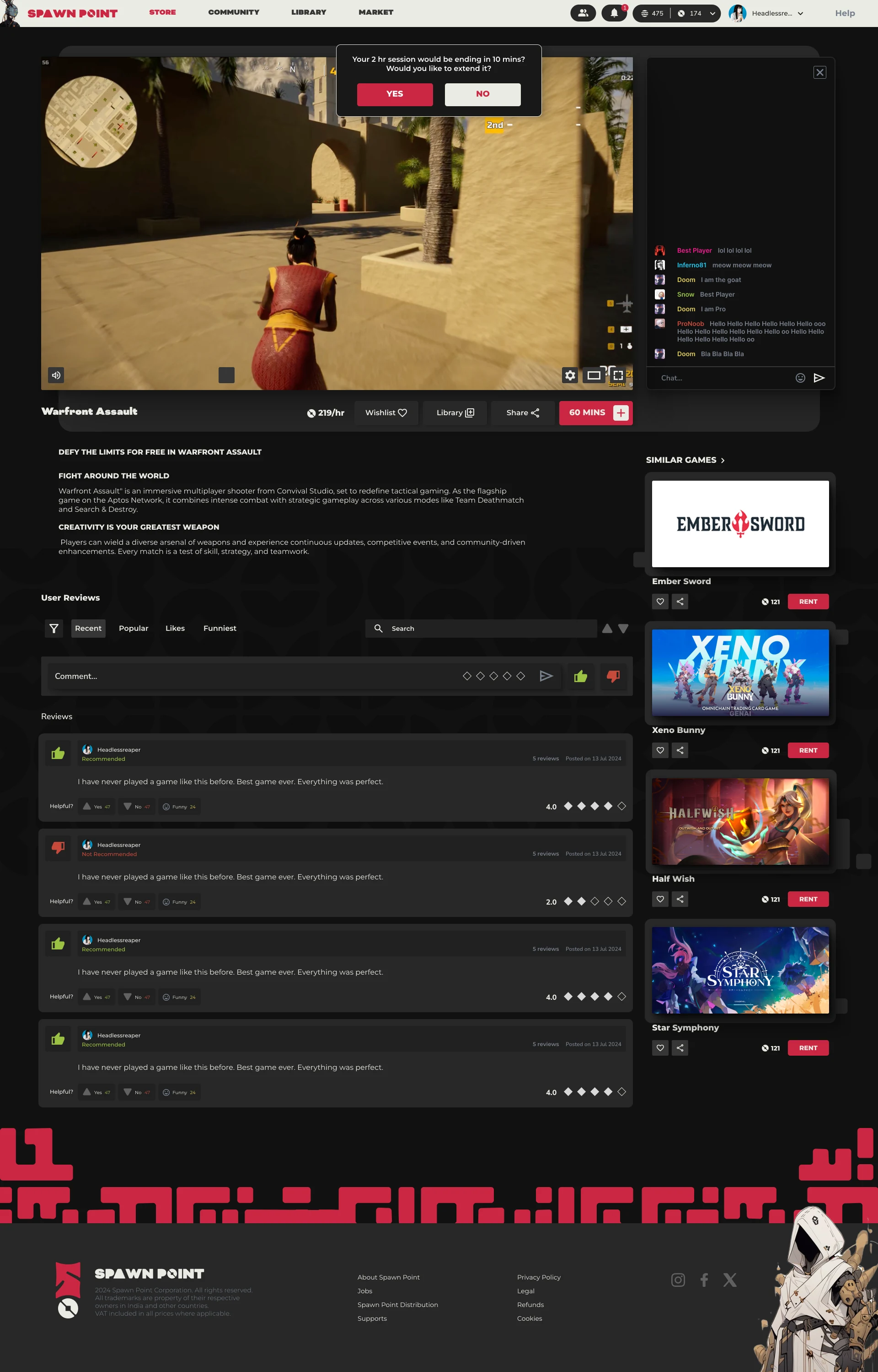
  4. Stay in control

    Limited time to play

    Reminders at 10 and 2 minutes before a session ends, with a one-tap extension.
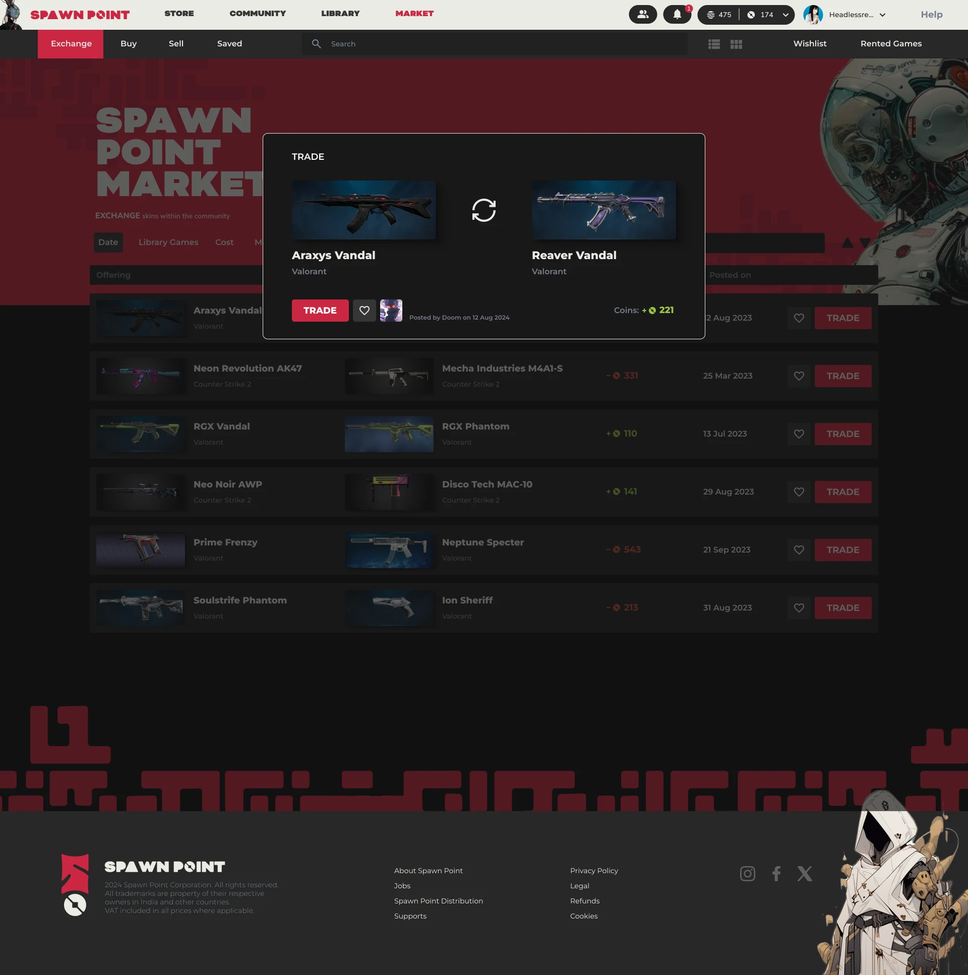
  5. Own and trade

    Interoperable in-game assets

    The market: trade and barter skins and assets across games.
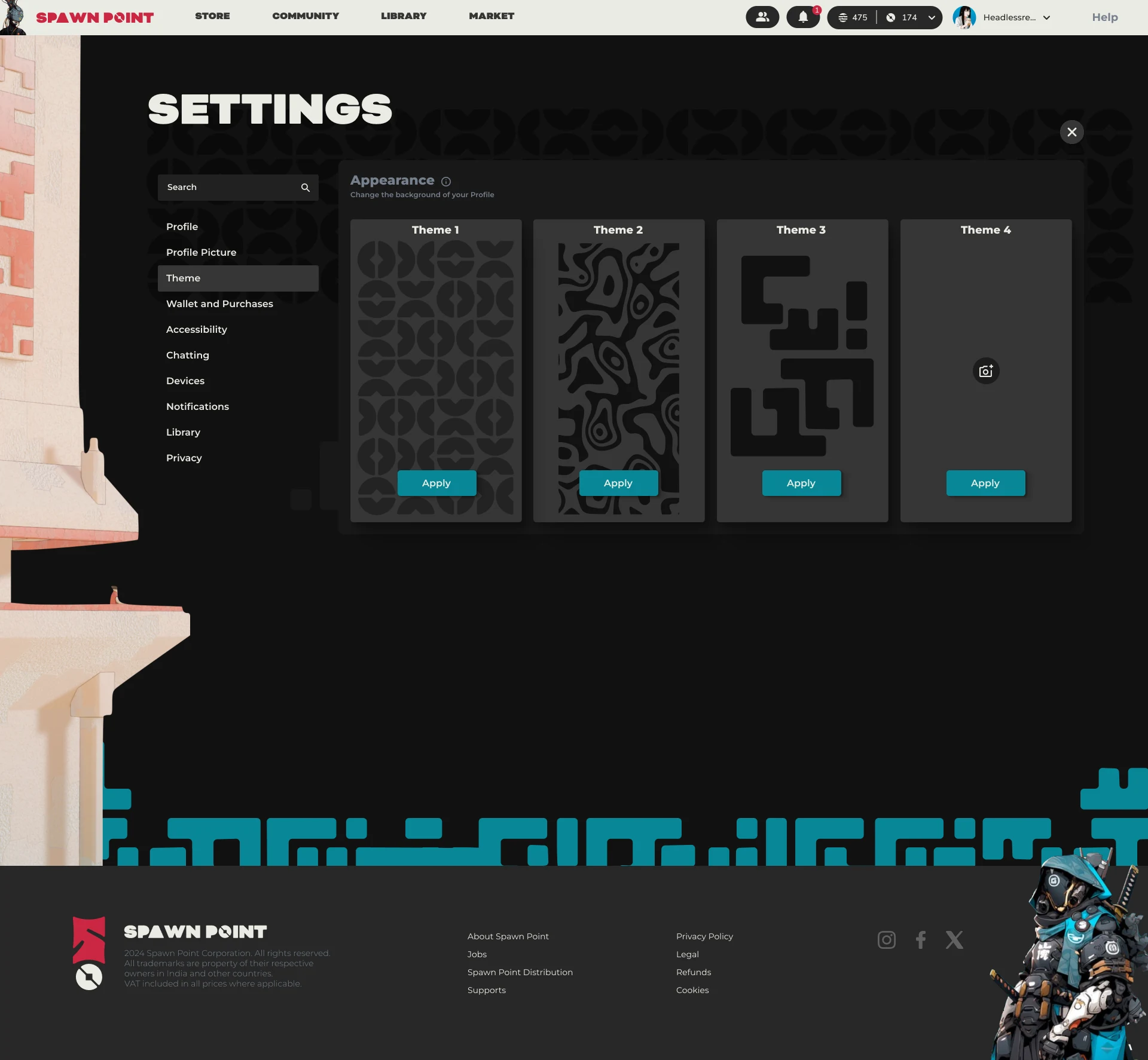
  6. Make it yours

    "Custom theme installation is time-consuming"

    Pre-made themes, applied in one click from settings.
08

Testing

Did it hold up? The MVP was reviewed in rounds with stakeholders rather than through a formal usability study. Their feedback reached me through the CEO.

  • Embrace the complexity

    Most stakeholders wanted to lean into complex game design, and the research backed them: deeper games are what attract pro gamers.

  • Gamers were curious

    The gamers who saw the concept were curious about it.

  • Minimal revisions

    The UI aesthetics were reaffirmed, with only minimal revisions.

On the road with ICC Camp

Spawn Point went through the first season of ICC Camp (Imagine Creation Combinator), an accelerator for Web3 games, and the brand went with it from Singapore to Hong Kong.

  1. 10 March 2024

    Joining ICC Camp

    Announcement graphic: the ICC Camp logo, a cross, and the Spawn Point mark.
  2. 13–16 March 2024 · Singapore

    A study tour, and a demo day at Google

    Four days with 31 Web3 game teams, ending in a demo day at Google Cloud's Asia-Pacific headquarters in front of Web3 gaming investors. Spawn Point came away with a mentor, Blockhive Capital founder Alex Yang.

    Google's office lobby in Singapore, with the Google letters and a screen reading ICC Camp welcomes. The ICC Camp Season 1 cohort posing with an ICC Camp flag in a meeting room.
  3. April 2024 · Hong Kong

    Demo day, and the Hong Kong Web3 Festival

    A demo day at Brick Lane, and the ICC Camp ceremony at the festival's Web3 Gaming Summit, where Spawn Point was one of five startups on stage.

    A packed room at the Hong Kong demo day, with the Spawn Point title slide on the screen. A presenter with a microphone in front of a slide about an untapped audience. A stage screen showing the Spawn Point slide: the logo, the platform's pitch and an early store screen. Five founders on stage under a row of startup logos, the Spawn Point logo among them.
  4. May 2024

    Google Cloud Singapore

    The Google Cloud team met on the tour came on board to help build the cloud architecture.

    Announcement graphic: the Spawn Point mark, a cross, and the Google Cloud Singapore logo.
The pitch trailer, put together by the team for the Singapore demo day.

What happened next

The pitch we designed for Spawn Point helped the company secure an Aptos grant and Google Cloud architecture support. Soon after, the company changed direction entirely.

Team

  • Vishrut Sagar Design Lead (Intern): branding, UX research, UI design, and the company's Notion workspace
  • Ninad Ingole Head of Design
  • UX Designer Market study, SUS scoring, selected user flows
  • The animation team Characters, backstories and sketches
  • Freelance video editor The pitch trailer

Brand book

Brand book, page 1 of 40
Brand book, page 2 of 40
Brand book, page 3 of 40
Brand book, page 4 of 40
Brand book, page 5 of 40
Brand book, page 6 of 40
Brand book, page 7 of 40
Brand book, page 8 of 40
Brand book, page 9 of 40
Brand book, page 10 of 40
Brand book, page 11 of 40
Brand book, page 12 of 40
Brand book, page 13 of 40
Brand book, page 14 of 40
Brand book, page 15 of 40
Brand book, page 16 of 40
Brand book, page 17 of 40
Brand book, page 18 of 40
Brand book, page 19 of 40
Brand book, page 20 of 40
Brand book, page 21 of 40
Brand book, page 22 of 40
Brand book, page 23 of 40
Brand book, page 24 of 40
Brand book, page 25 of 40
Brand book, page 26 of 40
Brand book, page 27 of 40
Brand book, page 28 of 40
Brand book, page 29 of 40
Brand book, page 30 of 40
Brand book, page 31 of 40
Brand book, page 32 of 40
Brand book, page 33 of 40
Brand book, page 34 of 40
Brand book, page 35 of 40
Brand book, page 36 of 40
Brand book, page 37 of 40
Brand book, page 38 of 40
Brand book, page 39 of 40
Brand book, page 40 of 40